Fiery M700 Self-Serve Station
Redesigning a kiosk-based self-service printing interface for universities, libraries, and retail environments — modernizing the hardware, simplifying the workflow, and rethinking the interaction model for a new generation of users.
This project is currently in development. It's a look into my design process on in-flight work — the thinking, trade-offs, and decisions — rather than shipped, measured outcomes. Screens shown are design artifacts from Figma.
- Company
- Fiery (formerly EFI)
- My role
- Senior UX Designer (one of two designers)
- Platform
- Kiosk touchscreen (10″+)
- Status
- In development (2025–present)
- Users
- Students, library patrons, hotel guests, retail customers
- Methods
- UX audit, competitive benchmarking, stakeholder workshops, heuristic evaluation
Design objective
A successful product designed for a different era of self-service.
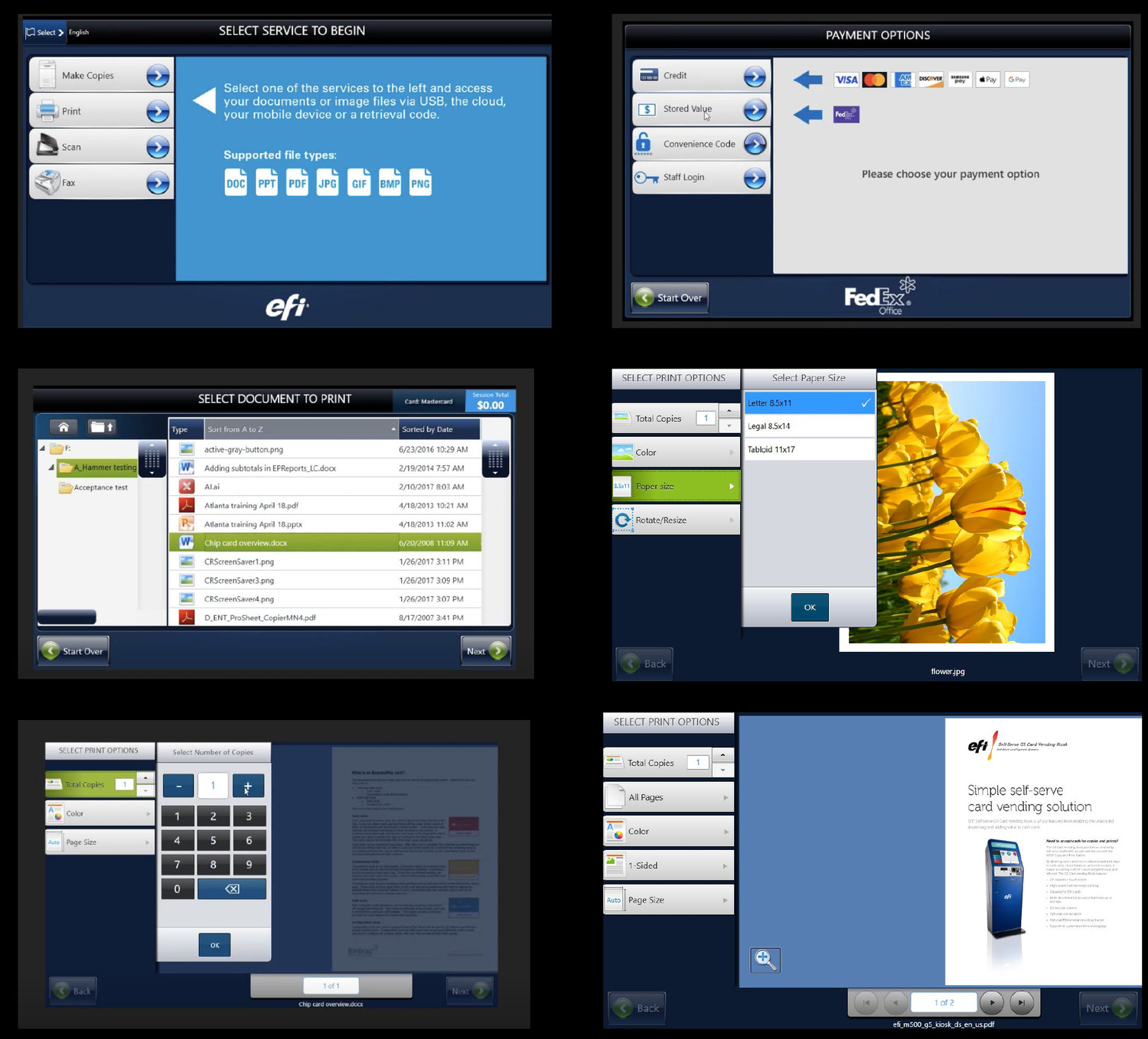
The M600 Self-Serve Station won BLI's Winter 2020 Pick Award and is deployed in hundreds of university libraries, hotel business centers, and retail print shops. Its 18-step print flow handles millions of jobs a year. But it shows its age.
I audited every step of the M600 flow against Nielsen's usability heuristics, benchmarked it against modern kiosk experiences (airport check-in, McDonald's order terminals, Elo and Aila retail kiosks), and ran stakeholder workshops with product management and IT administrators. Two consistent themes emerged: “too many screens” and “students give up and ask staff for help.”
The redesign keeps the same proven flow but fixes the usability problems systematically. The strongest before/after comparisons show the most impactful changes.
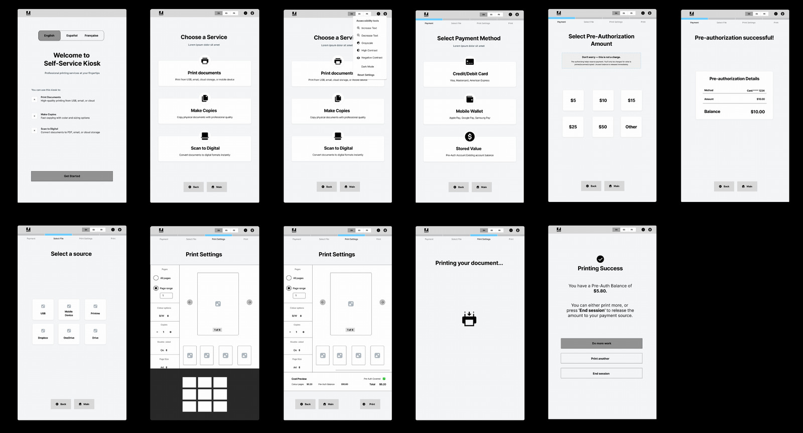
Initial wireframes
Grounding the redesign in kiosk principles.
These wireframes were informed by secondary research — industry whitepapers and kiosk usability guidelines — before any visual design began.
Consistency & simplicity
Consistent layouts and a small set of options per screen reduce cognitive load in a public context.
Intuitive task navigation
Core functions sit at clear entry points, structured as guided, sequential steps with explicit prompts.
Multi-modal & high contrast
Icons, text labels, and colour cues together — readable across languages and literacy levels.
Accessibility & inclusiveness
Reachable controls and clear language for users with mobility, vision, hearing, or cognitive limitations.
Error prevention & recovery
Constrained inputs and disabled actions until required info is provided; clear explanations when errors occur.
Speed & flow
Sensible defaults, fewer steps, and support for pre-submitted tasks to cut interaction time in shared spaces.
Privacy & data security
Sessions clear, transactions encrypt, and users log out automatically after inactivity.
Payment clarity
Costs presented clearly before authorization, with immediate transaction feedback.
Guidance & feedback
Step indicators, helper text, and progress feedback so users always know their current stage.
The key screen that was hotly debated
Print settings: the screen I argued against, twice.
The print-settings screen went through a significant redesign mid-project. It's the clearest example of using evidence — and the hardware itself — to change a decision the team had already aligned on.
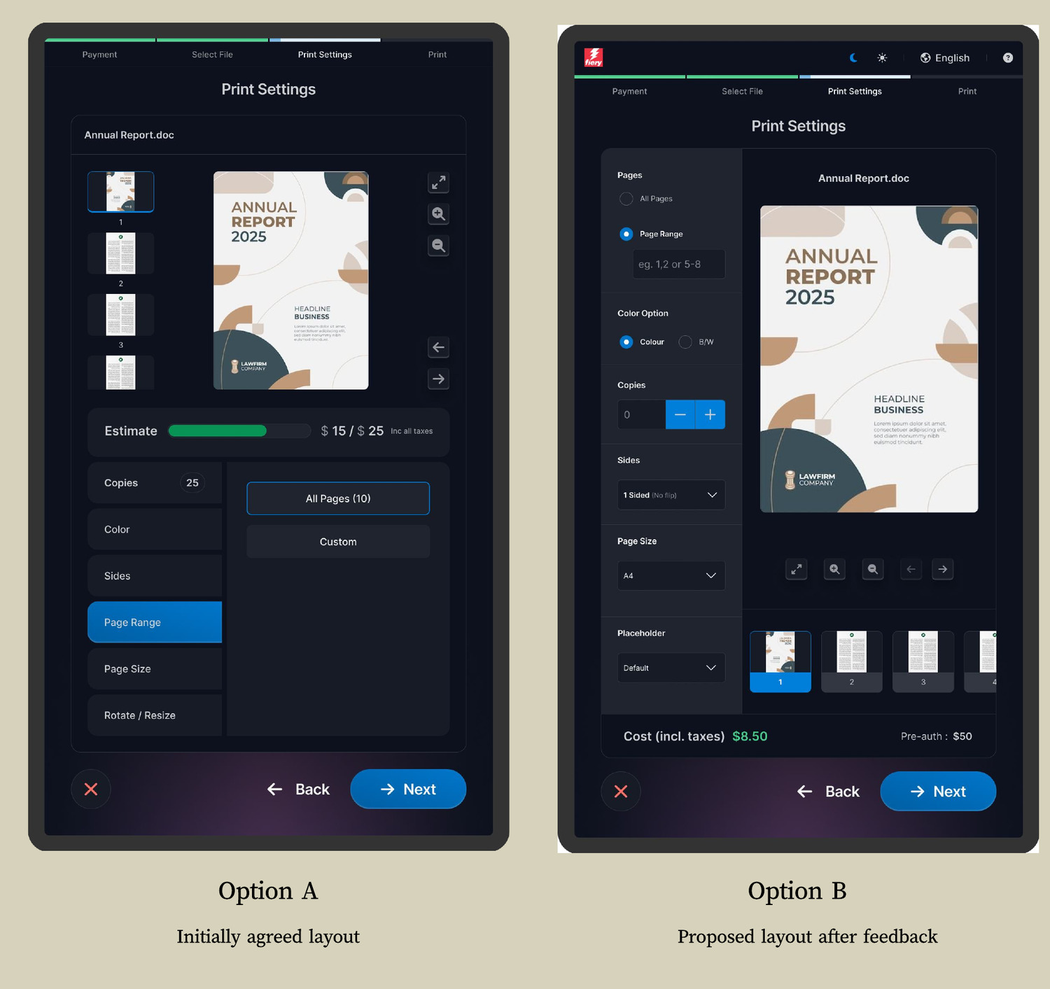
The initial wireframe consolidated all settings, the document preview, and the cost estimate into a single dense view. That was the agreed direction coming out of the wireframe stage. I was skeptical and raised it in a design review: a screen packed with controls, a preview, pagination, and a cost bar all competing for attention doesn't simplify the M600's problem.
There was pushback — the team had already aligned on the wireframe. But when stakeholders reviewed the prototype on the actual kiosk hardware, they reached the same conclusion independently: too cluttered. That gave me the opening to propose an alternative.
The redesign borrows a familiar mental model — the print dialog on a desktop operating system. Settings on the left as a vertical list, each showing its current value; document preview on the right; cost at the bottom. Anyone who has printed from a laptop recognises this instantly, so they don't have to learn a new interaction pattern on a kiosk in a library.
It showed the same information as the rejected wireframe, but structured around a reading pattern users already have. That's what made stakeholders prefer it — not that it showed less, but that it took less effort to parse. Even so, it had its own problem: dropdowns and radio buttons proved cumbersome for touch. So we iterated again.
Final design
Same layout, touch-friendly controls.
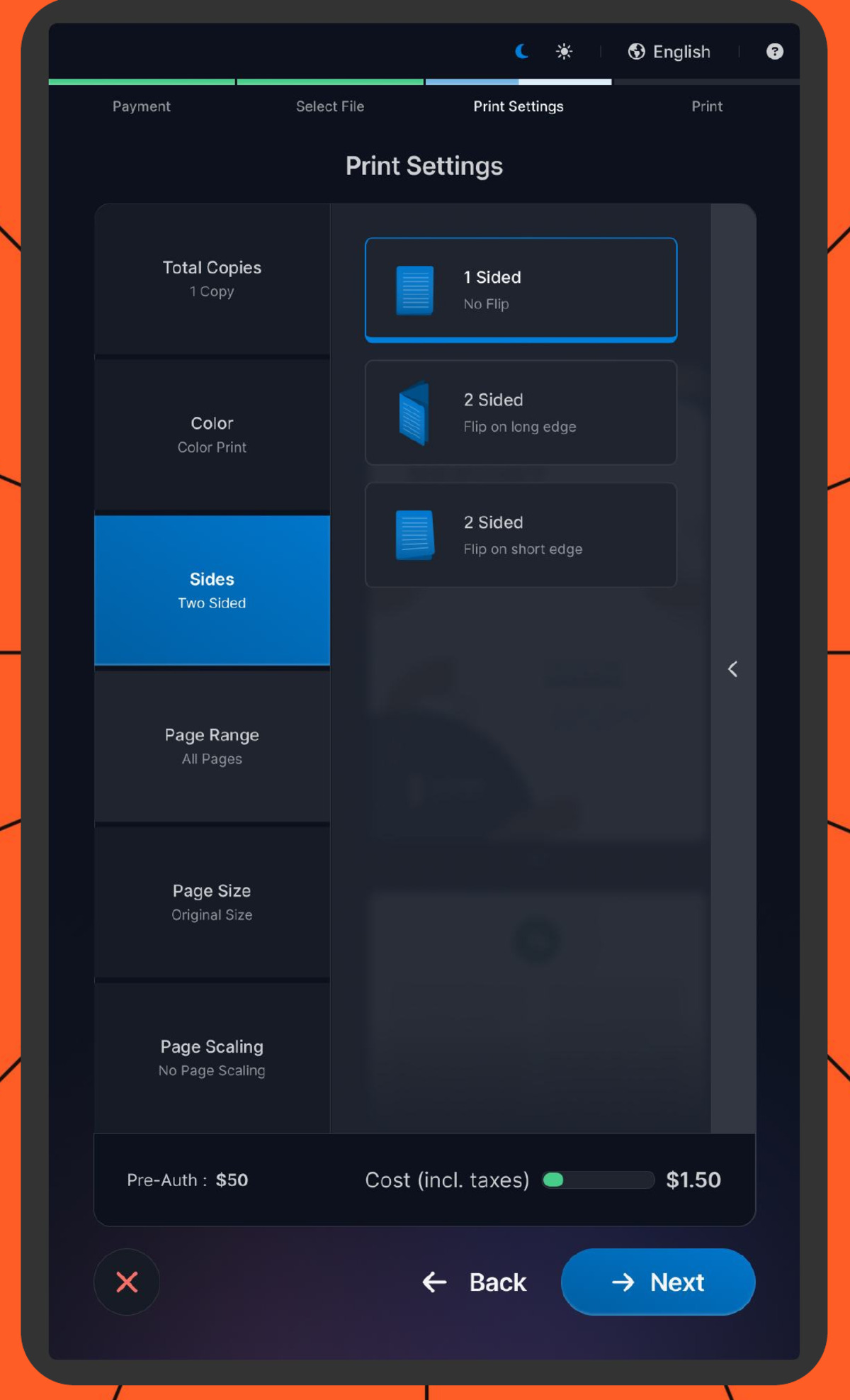
Dropdowns require precision tapping on a touchscreen — hit a small target, wait for the menu to expand, then tap again. Radio buttons were worse: the circular targets were too small for finger input, and the labels sat close enough together that mistaps were constant. What worked fine in a desktop wireframe became frustrating at arm's length on a kiosk.
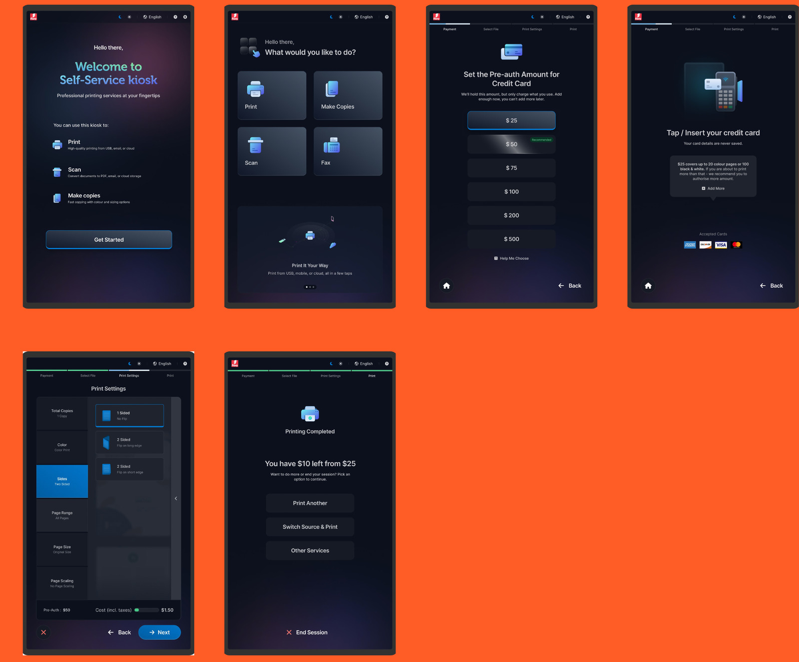
We replaced every dropdown and radio button with large, tappable selection cells — full-width rows showing the setting name and its current value (Total Copies: 1 Copy, Color: Color Print, Sides: Two Sided). No precision required: users tap a large area, make a choice, and return to the settings list.
Design trade-off
The trade-off was the document preview. In the original wireframe the preview sat alongside the settings at all times. In the final layout, tapping a setting opens an overlay that partially covers the preview — you can't see the document and change a setting simultaneously. I accepted this because the alternative — cramming touch-friendly controls and a preview into the same visible area — was exactly the clutter stakeholders had already rejected. The preview is always visible when you're not actively changing a setting, and it updates immediately after each change, so users still get confirmation their choices are applied.
Final designs
The redesigned flow, end to end.
From welcome and service selection through pre-authorization, print settings, and session completion — a calm, high-contrast, touch-first experience.
Next · 03