Intelligent Sustainability Management System
Designing a satellite + AI platform for UK utilities to measure biodiversity, track carbon, and meet regulatory targets across thousands of sites.
These outcomes were enabled by the platform's satellite analysis and AI models, through the interfaces I designed for sustainability teams.
- Company
- AiDash Inc
- My role
- Senior UX Designer (sole designer)
- Platform
- Web SaaS application
- Users
- Sustainability managers, ecologists, field teams, C-suite
- Methods
- Stakeholder interviews, contextual inquiry, iterative prototyping
- Timeline
- 2021–2023
The problem
There was no product to redesign — only a fragmented workflow.
The “before state” wasn't a bad interface. It was the absence of one: a job spread across GIS software, spreadsheets, field tools, email, and reporting decks.
Multiple UK utilities, each managing hundreds to thousands of distributed sites, needed to measure and improve biodiversity under the Environment Act 2021. The traditional approach — sending ecologists to physically survey each site — would take years and cost up to 20× what was budgeted.
No existing tool brought habitat assessment, carbon tracking, natural capital accounting, and regulatory reporting into one platform. AiDash set out to build that platform, and I was brought on as the sole UX designer to design it from the ground up.
Research & discovery
Three research streams, run in parallel over eight weeks.
I interviewed two UK utility clients who served as design partners. Each stream produced findings that shaped the product's information architecture.
Remote interviews with sustainability teams
I walked through existing workflows screen-by-screen with sustainability managers and ecologists — how they planned site visits, recorded field data, calculated BNG scores, and assembled compliance reports — asking them to share their screens and show me the tools they used day-to-day.
Research finding
Ecologists didn't work in one system. A single site assessment touched QGIS for mapping, Excel for BNG calculations, a separate tablet app for field notes, email for photo sharing, and PowerPoint for reporting. One ecologist had 6–8 browser tabs and 3 desktop applications open while walking me through a routine assessment. The fragmentation wasn't just inefficient — it introduced errors at every handoff point.
Domain expert interviews
I interviewed AiDash's remote-sensing scientists to understand how satellite habitat classification works — its confidence levels and failure modes — and spoke with the regulatory team about Defra BNG metric requirements, Woodland Carbon Code standards, and Ofwat ODI reporting timelines.
Research finding
The data science team proposed showing AI confidence scores (“87% probability this is Modified Grassland”) alongside each classification. When I tested this with ecologists, it backfired. They didn't trust percentage-based confidence — they wanted to evaluate the classification against the same criteria they'd use in the field. “Show me the evidence, not a number” was the consistent response. This directly shaped the condition-assessment panel.
Stakeholder mapping
I mapped four distinct user types and their primary tasks to understand where the platform's information architecture needed to diverge.
Research finding
The sustainability director and the field ecologist both needed to see “biodiversity score” — but meant completely different things. The director meant a portfolio-level number for board reporting. The ecologist meant a per-polygon condition score based on species density and sward height. A single “biodiversity dashboard” would serve neither. This insight led directly to the layered architecture: the same data, surfaced at different depths depending on who's looking.
From findings to architecture
Three findings shaped every design decision that followed.
Layered depth, not separate views
Different users needed the same data at different granularity, so I designed a single hierarchy — portfolio → site → habitat → polygon — rather than separate dashboards per role. Each level reuses the same patterns, so the interface stays learnable as users go deeper.
Evidence over confidence scores
Rather than AI probability percentages ecologists didn't trust, the condition assessment presents the same domain-specific criteria they use in field surveys. Trust is built through professional judgment, not statistical persuasion.
Consolidation as the value
The before-state involved 6–8 disconnected tools. Every design decision was tested against one question: “Does this eliminate a tool switch?” If the ecologist would still open Excel after using ISMS, the design had failed.
Design trade-off
I considered building role-specific dashboards — an “executive view” and an “ecologist view” with separate navigation. The PM pushed for this because it simplified the requirements. I argued against it: the research showed these users need each other's context. The director needs to drill into a site to understand why a score is low; the ecologist needs portfolio-level targets to prioritise. We settled on the layered hierarchy with progressive disclosure. Harder to build, but it keeps everyone in the same system.
Design decisions
Four screens, one hierarchy.
Each screen is the same layered idea at a different depth — and each carried a real trade-off.
Portfolio Dashboard — two audiences, one screen
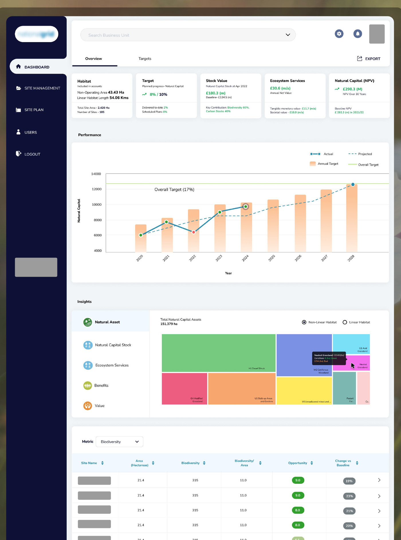
The dashboard solves the two-audiences problem by layering: executives read top-down, ecologists read bottom-up. The top row of KPI cards (habitat coverage, target progress, £180.3M stock value, £30.6M/year ecosystem services, £298.3M 30-year NPV) gives the director a 10-second status read for board prep — the same metrics she told me she manually assembled from four spreadsheets every quarter.
The performance chart answers “are we on track?” visually, with a dashed projection showing where the portfolio is headed without intervention — a specific request from a user who wanted early warning, not just retrospective reporting. The site table at the bottom ranks all 185 sites by Opportunity score. This is the ecologist's entry point; clicking a row opens the site view.
Design trade-off
The data science team wanted to lead with a portfolio-level map showing all 2,000 sites as coloured dots. It looked impressive but was operationally useless — you can't make decisions from 2,000 dots. I pushed for the table-first approach because it makes the portfolio sortable and actionable. The map appears at the site level, where spatial context actually matters.
Site Overview — from portfolio to polygon
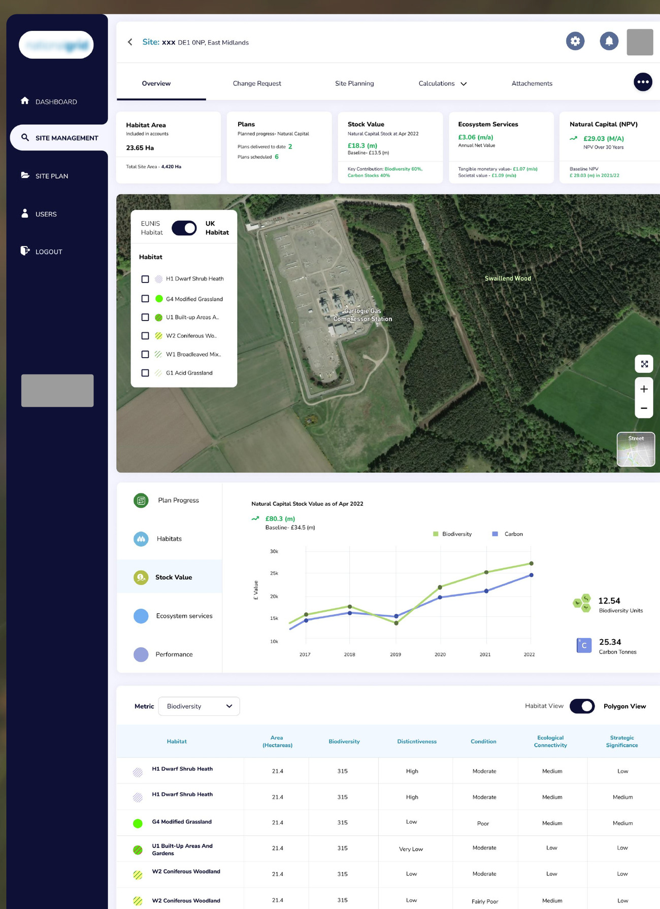
Ecologists work spatially — they need to see habitats on a map — but they also need structured data for BNG calculations. The site view bridges both. The KPI cards repeat the dashboard's pattern, now scoped to one site, so users don't relearn the interface at each level.
The vertical tab strip (Plan Progress, Habitats, Stock Value, Ecosystem Services, Performance) was a direct response to the “6–8 open tabs” finding — each tab replaces one of the disconnected tools ecologists previously used. The Habitat View / Polygon View toggle lets them switch between aggregated and granular analysis; selecting a polygon in the table highlights it on the map, and vice versa.
Design trade-off
I debated whether the map or the data table should be primary. Early prototypes led with a full-screen map and a collapsible panel — but in reviews, ecologists consistently resized the data panel to 50% or more. They needed the numbers as much as the spatial view. The final layout gives both equal weight: map on top, table below.
Condition Assessment — where trust is built
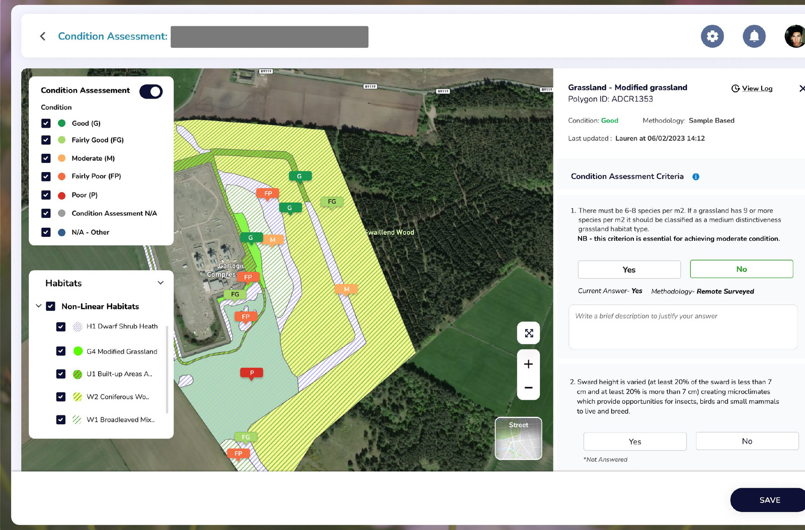
The right panel is the core trust mechanism. When an ecologist selects a polygon, they see the AI's classification, its condition rating, the methodology, and who last updated it. Below that, Condition Assessment Criteria present the same questions they'd answer in a field survey (“There must be 6–8 species per m²”) with Yes/No buttons and a justification field.
This isn't a feedback form — it's a professional judgment interface. The system records the answer and methodology and maintains a View Log, so every assessment has a full audit history. For regulatory compliance, it retains both the original AI classification and any human override.
Design trade-off
Early designs showed the AI's confidence score alongside the criteria questions. I removed it after testing showed confidence scores created authority bias: ecologists felt they needed justification to override a high-confidence classification, even when their professional judgment said otherwise. Removing the score — and presenting only the criteria — made them more willing to override. I shared this with the data science team, who pushed back at first but agreed after reviewing the session notes.
Scenario Planning — making what-if modelling accessible
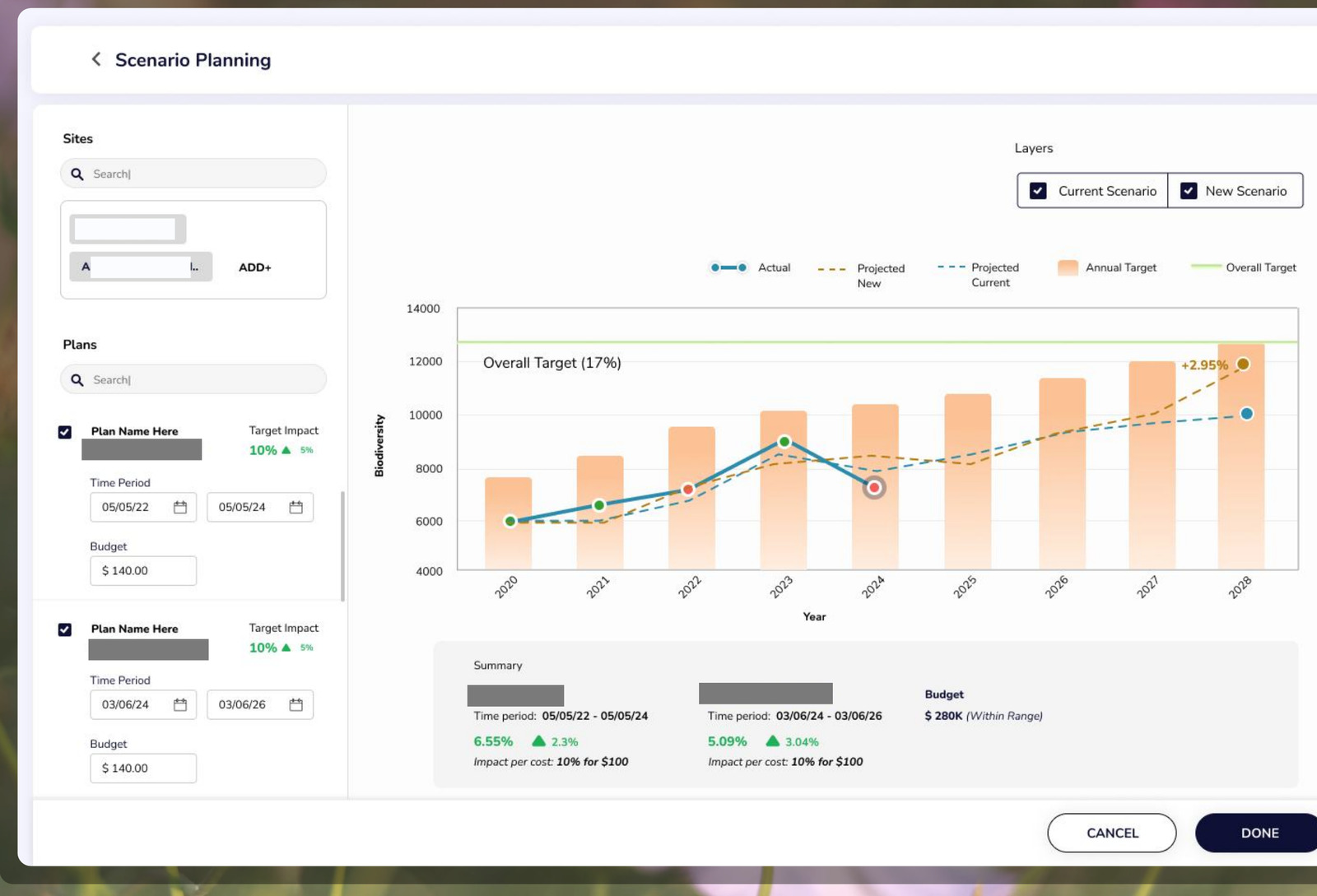
Site planners need to justify interventions to leadership with projected outcomes and budget impact. The existing process was a consultant producing a one-off report over several weeks. The left panel lets a planner define an intervention in one place — sites, management plan, target impact, time period, and budget — instead of assembling it across spreadsheets.
The projection chart deliberately mirrors the dashboard's Performance chart — same axes, target bands, and colour language — so anyone who can read the dashboard can read a scenario. The Summary panel is the element I'm most proud of here: it auto-generates impact per site with impact-per-cost efficiency and total budget — the exact language a planner copies into a leadership email. Before ISMS, assembling those numbers took a consultant 2–3 weeks; here it's generated in seconds.
Outcomes
One system replacing a stack of disconnected tools.
Before ISMS, ecological assessment was fragmented across GIS software, spreadsheets, separate field apps, and manual reporting — slow, error-prone, and hard to scale across hundreds of sites. I designed a unified platform that consolidated these workflows into a single system, with a layered architecture that let executives and ecologists work in the same interface at different levels of detail.
Scenario planning replaced consultant-built reports that took weeks with projections generated directly in the system. Across multiple deployments, the platform has been used to assess thousands of sites and map tens of thousands of habitats from satellite data — enabling faster biodiversity reporting and significantly reducing the cost of traditional survey workflows.
“The quality and accuracy of the AiDash habitat mapping is the best I have seen to date from remote sensing, and for the first time it is comparable with traditional ground survey mapping. This is a paradigm shift for the future of mapping and monitoring habitats.”
Reflections
What I'd carry forward.
What I'd do differently
I'd push for field observation. All our research was remote — interviews and screen-shares gave strong insight into workflows, but I never watched an ecologist use the condition-assessment interface in actual field conditions: poor connectivity, small laptops, time pressure, glare. The override workflow works well on a desktop; I'm less sure it's optimised for a laptop balanced on a Land Rover bonnet.
What I'm most proud of
Killing the confidence score. It's a small decision — remove one number — but it changed the entire dynamic between ecologists and the AI. The data scientists saw it as removing useful information; I saw it as removing a subtle power dynamic that discouraged professional override. That's the kind of decision that doesn't look like design but changes whether users trust the product.
What this taught me
In regulated enterprise B2B, the UX challenge isn't simplification — it's building interfaces that respect domain expertise while eliminating operational friction. ISMS worked because it augmented ecologists rather than replacing them, and because the architecture was role-driven rather than client-driven, the same design scaled from 185 sites to over 2,000 without per-client customization.
Next · 02